


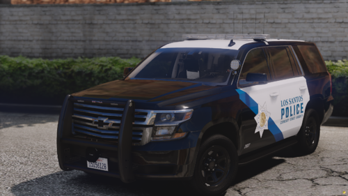
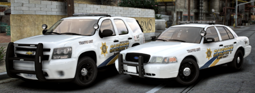
Portland Police Bureau (PPB) Mini-Pack
This pack includes two 2011 Crown Victorias(CVPI) model's and a 2016 Ford Police Interceptor Utility(FPIU) model.

Updated: 03-27-2017 Look below for more details
*VIDEO PREVIEW AT THE BOTTOM OF THE PAGE*
Welcome and thank you for taking a look at my first textures, as well as my first upload to LCPDFR! I hope you will enjoy the skins and I really look forward to hearing your feedback which will help me hone in on the perfect result. One thing to note - This is still a work in progress, as I intend to continue growing this pack to include a variety of other vehicles in the LSPDFR community.
This pack includes textures that are compatible with at least four different 2011 CVPI models and one FPIU model currently in use in LSPDFR including:
ELS
-
2011 CVPI - Bxbuggs123
-
2011 CVPI - ablaze
-
2011 CVPI - thegreathah
-
2016 FPIU - TheHurk
NON-ELS
-
2011 CVPI - Captain14
There may be more, and I will update this list as I find them.
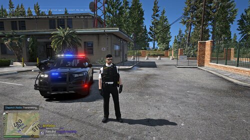
PREVIEW
*Future Updates*
- - - New Vehicles: - - -
>2012 Chevrolet Caprices PPV
- - - Possible? (Depends on interest) - - -
>2014 and 2016 Dodge Charger (PPB doesn't use chargers right now)
>2014 BMW R 1200R
PPB doesn't have a wide variety of vehicles right now. The CVPI is being phased out for the FPIU and Chevy Caprice. They also have motorcycles with rather basic skins, but I will add them for a more thorough experience. If you have suggestions on other necessary vehicles, textures or some other agencies, please let me know in the comments below, private message or comment on youtube :)
_________________________________________________________________________________________________________________________________
If you have any difficulty installing these, be sure to read the README first. I went into more detail than probably necessary for anyone who has used a texture before. If this doesn't solve the problem, feel free to send a message or comment and I'll do what I can to help :) Also, if you find an issue with the file or textures, please contact me before immediately giving the files a poor rating. I will do my best to make it right.
What's New in Version 1.0.1
Released
- Edited Font style for "Supervisor"
- Side and back text adjusted size/position
- Added "E" on left side of back text
- Sworn/Dedicated size adjusted
- Darker "blue" color / less purple
CVPI w/out wrap around: bxbuggs123
FPIU: TheHurk

.thumb.png.d642ff9c57245d19627b16114298b2ea.png)

![[Non-ELS/DLSv2] LAPD BMW R1200RT-P [Addon/FiveM]](http://s3-screenshots.int-cdn.lcpdfrusercontent.com/resize/500/-/monthly_2026_04/1.Thumbnail.thumb.png.ee831bb3bb39882cf936bde4872b0c88.png)

Recommended Comments
Create an account or sign in to comment