


Creators: Due to background reprocessing of files, approvals and file security checks may be delayed. Thanks for your patience.

Crunching
Members
-
Joined
-
Last visited
Everything posted by Crunching
-
 Meant the one with the taser from the fifth picture
 -
Whose belt is that with the single angled mag?
-
-
 If you rotate the graphics to match the angle of the body on the template it will look a lot better.
 -
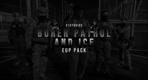 Unrealistic, ICE got an actual uniform
 -
 Mildly inconvenient to install, but solid nonetheless
 -
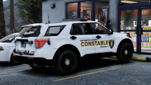
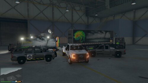
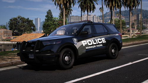 Fits Kane's base. Working on some EUP to match and finished this first. Vehicle in screenshots: www.lcpdfr.com/search/?q=ULSA&quick=1&type=downloads_file&nodes=44,46,51,47,45,50,54,52 Join my discord to see upcoming textures, current listings or commission custom work. https://discord.gg/G4cvQqT
 -
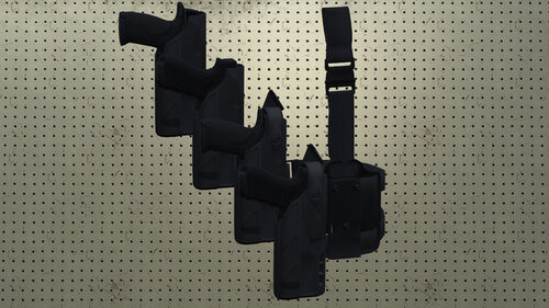 Prefer my drop legs further up on the thigh these days, but the holster itself still looks pretty good.
 -
.thumb.png.38fdcdf4032739b2ea56a61a64d5fcfd.png) California compliant means more than just semi-automatic, some explanation of what specifically it's doing would make more sense than the name does.
California compliant means more than just semi-automatic, some explanation of what specifically it's doing would make more sense than the name does. -
-
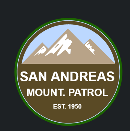 I get it, it looks generic enough at a glance. Took me looking up the logo to find out that's why the E is in the center of it.
 -
The Grapeseed patch has a police exploring logo on it boss.
-
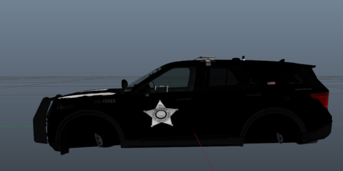
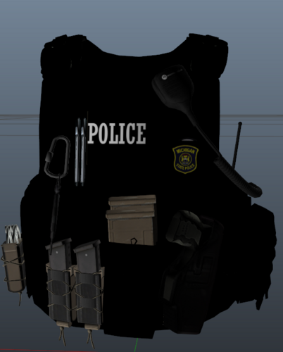 There are ways to change colors of vests without painting the whole thing pitch black, I am begging you to learn them.
 -
-
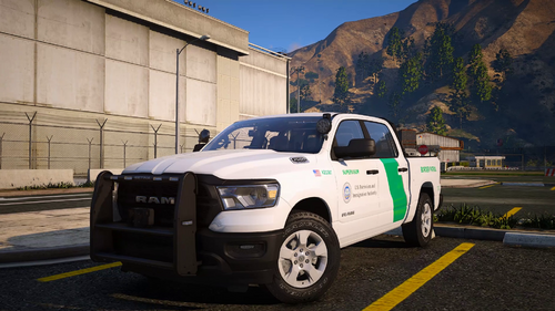
 It's gone because the website hosting it is gone. Gtapolicemods is back, but I'm pretty sure the pack isn't there anymore. Most vehicles should work on most common models except the 2020 explorer, which I may end up redoing for the more used template
 -
 It's taking a significant amount of effort to be constructive here but I'll do my best to keep it that way. Font choice. Basic sans serif has it's purpose, and it's not being on police cars. Enter sansman is solid, and you can google "police car fonts" and find some suggestions. Some of them will be overused, but that's not inherently a problem. Scrolling through whatthefont or similar sites is also good. Positioning. It's easy to just put something in a spot and call it a day, but most police car designs, whether you realize it at first glance or not, have some symmetry or alignment to them. I can see you're kinda trying to do that with some of them, but there's just a bit too much distance between things for it to really work. Keep bumper stickers on the bumper, same thing for the visibility striping. On the city of Future design: please, for the love of god, in this era of infamous impersonators, wannabe cop security guards and bail enforcement, put the word "Police" or "sheriff" or "state trooper/police/patrol" somewhere on the car aside from the badge. I realize there are agencies that do not have this IRL. My point remains that they should. I realize a lot of this comes with time. I highly suggest recreating some designs around you, or that you see around the internet (photo archives, r/policevehicles, etc.) just for your own lspdfr or what have you just as practice. Experimenting with your software and just trying something, even if it doesn't get posted anywhere is how I taught myself pretty much all my graphic design ability.
 -
-
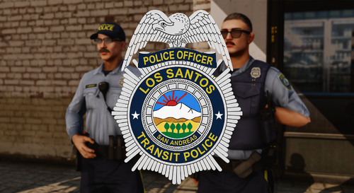
 Where badge
 -
-
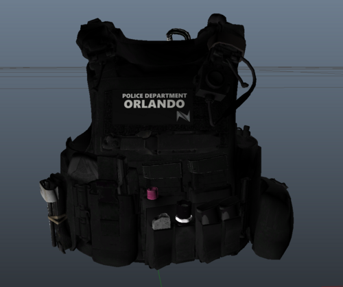 You'd want "Police" to be the biggest word on the patch. At a distance you'd see just "Orlando" which tells people fuck all.
 -
 Not sure what software you're using, but I can guarantee it has some select tool you can use to quickly get rid of the white outline around logos. Gimp has the fuzzy select or select by color, everything else has something to the same effect.
 -
 Not the point, go away
 -
There are far better multicam bases you could've used. Doesn't look like you overlayed it or anything either. Also weird to show it with a patrol belt. The rest of it is fine... barring a handful of nitpicks.
-
-


.thumb.png.38fdcdf4032739b2ea56a61a64d5fcfd.png)


