


AverageDoe
Members
-
Joined
-
Last visited
Everything posted by AverageDoe
-
-
 Graphic design isn't slapping on a layer of red and adding a badge to it. Graphic design isn't as easy as it looks. I skin privately for groups and I spend up to 8 hours working and perfecting skins. Longest project I did took 2 days. And do you know what looks cool, something that isn't fully red with a badge in the crevice of the door.
- 9 comments
- 3 reviews
-
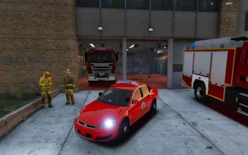
Three words: What is this... "Please don't pirate this" Just slap on a red layer and a badge and done. I don't think that anyone would pirate this tbh...
- 9 comments
- 3 reviews
-
-

- 2
-
-
-
-
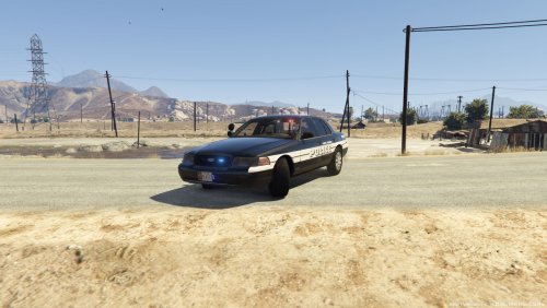 Great skin. Seems a bit plain. Maybe add a US flag in the back somewhere, but keep it small. The plate says Texas btw.
 -
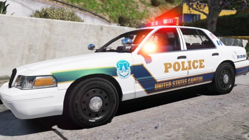 A for effort. The back is inaccurate. US Capitol Police should be smaller and should be in a curve around the Ford logo. From all the times I've seen a K9 Vic, they do not have K-9 on the back of it. The flag by the back passenger windows are inaccurate. USCP has a waving flag and you have a straight flag. On the popped out part of the vic, the line should not continue on to it. On the line that goes to the headlights, the top of it doesn't smoothly connect to the top of the headlight. Police on the side isn't slanted and doesn't have a black outline. Maybe use a different font.
- 2 comments
- 1 review
-
-
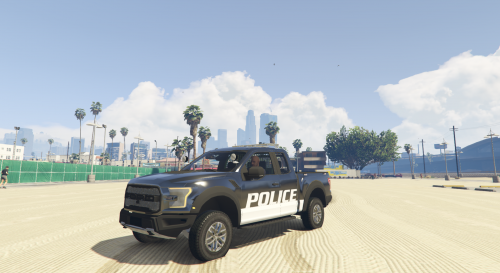 Wow. I love this model. Skins are so "fun" to make for this raptor. 5/5 Would recommend :D
- 36 comments
- 15 reviews
-
-
- 1
-


