


Ace.
Members
-
Joined
-
Last visited
Everything posted by Ace.
-
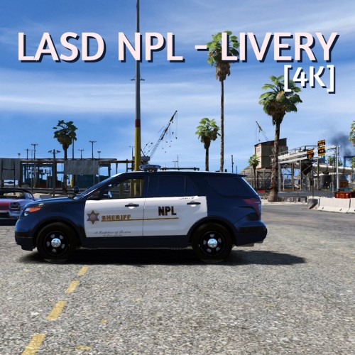 NPL?
NPL? -
Theres no real fix for this, its something that happens with EUP naturally.
-
*ghettobird intensifies*
-
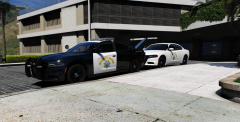
From the album: Los Angeles
-
From the album: Los Angeles
-
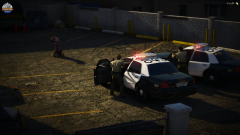
From the album: Los Angeles
-
 hi yes ill take approximately 20 of those
 -
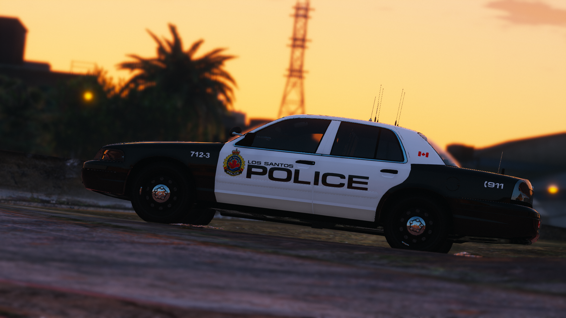
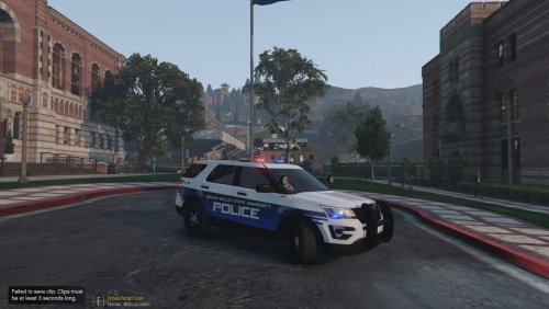
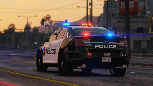 Hi there! I bring you my first release. I have been a lurker in this community for years, creating textures for the various private clans I've been in. I've decided to give back to the community starting with this texture pack. These cars are based off of the Hamilton Police Service in Ontario, Canada. These are specifically made for this pack here, and any cars that use the same templates. Each vehicle comes with 5 liveries each, 4 patrol liveries and one supervisor livery. If you fine people like these textures, I will be happy to make and release more. I hope you all enjoy!
- 2 comments
- 3 reviews
-
-

- 7
-
-
 Very nice. I would highly recommend tilting the text on the side to parallel the bottom of the car and the GFX you have going across the car. Other than that, very nice. Looking forward to seeing more from you. Example on how its unparallel;
- 2 comments
- 1 review
-
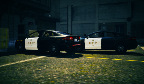 Honestly really good. Only 2 issues are: 1. "O.P.P." and "S.A.P.P" seems a little bit too stretched out. 2. The top of the car (like the charger) should be white with black car numbers. Overall great job, you got the strip going along the doors, pretty good sizing of everything, nice job.
- 1 review
-
-
- 1
-
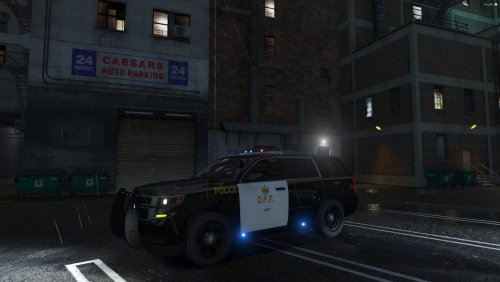 You did a pretty okay job, but I have a couple of issues. The O.P.P on the side seems a little bit thin, throw a Faux Bold on that, and that should fix the issue. The font colour on the side of the car is slightly different from the text on the top, and the back. The font colour of the "O.P.P." on both sides of the car (however barely noticeable) are different. The O.P.P "Crown" on both sides is quite larger then in real life. The "3-287" on the left (or bottom of the template) is not completely aligned with the "O.P.P." I know it's pretty hard to replicate, but there is a reflective strip that goes along the top part of the doors. The "3-287" is supposed to be yellow with a black outline, not black with a yellow outline. There is no plates. The "287" on the top of the car should be white, and not yellow. I'm pretty sure the "3" on the top of the car is the wrong way. I'm an OPP fanboy, and I simply had to point out these issues. I'm going to give you 2 stars for the effort. Keep up skinning man, you will improve with time.
- 1 review
-
-
- 1
-
 Can somebody make a preview video? I think that would be appreciated by everybody.
- 27 comments
- 3 reviews
-
-
- 4
-


